by George Socha
Vol. 101 No. 2 (2017) | Can science save justice? | Download PDF Version of Article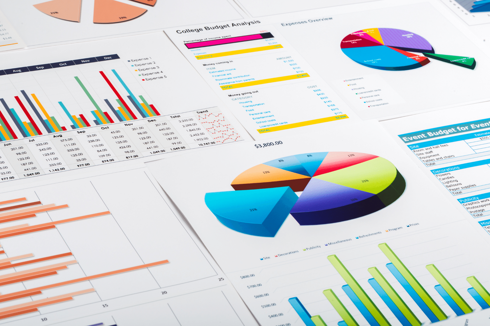
The legal technology press is replete with articles touting the advantages of Technology Assisted Review (TAR), mostly as a way to streamline the review of electronically stored information (ESI) and to help reduce review costs. Recently a growing number of articles have pushed into an area of TAR both new and old: the use of data analytics, especially data visualization, across all stages of the EDRM (E-Discovery Reference Model).
According to the TechTarget website (www. techtarget.com), a popular resource for techies, data analytics “is the process of examining data sets in order to draw conclusions about the information they contain, increasingly with the aid of specialized systems and software.”1 The article goes on to note that “analytics technologies and techniques are widely used in commercial industries to enable organizations to make more-informed business decisions and by scientists and researchers to verify or disprove scientific models, theories and hypotheses.”
Data visualization, to cite TechTarget again, “is a general term that describes any effort to help people understand the significance of data by placing it in a visual context. Patterns, trends and correlations that might go undetected in text-based data can be exposed and recognized easier with data visualization software.”2
Data visualization is well established in the business, scientific, and educational communities. For anyone seeking to learn more about the broader uses of data visualization, I highly recommend the books published by Edward Tufte, a statistician, artist, and professor emeritus at Yale University, especially The Visual Display of Quantitative Information, which was first published in 1983.3
Litigators long have had access to tools that place ESI in context. These tools work with the contents of files (the text of e-mail messages and word processing documents, for example) and metadata about those files (authors, dates messages are sent or created, etc.). An early example was Attenex Patterns,4 which I first used in 2003, a tool often referred to both with praise and derision as the “Petri dish.” (See Figure 1.)

A variety of data visualization tools are available to help counsel and clients better understand the significance of ESI. Such tools draw attention to patterns, trends, and correlations in the ESI that help litigation departments prepare their cases. These include tools specifically built for e-discovery, such as kCura’s Relativity5 and Brainspace Discovery,6 as well as tools common in the larger world of data analytics, such as Tableau.7 These tools are very well used: According to kCura, for example, more than 150,000 people at 12,000+ organizations use Relativity.8
Another type of tool clusters information into logical groups for simplified sorting. Relativity’s Cluster Visualization Circle pack,9 for example, works within Relativity (and other e-discovery tools) to create groups of conceptually similar documents. To create these groups, of course you first need to get your ESI into Relativity’s software. You then select documents of interest, which may be documents from several sources or documents within a particular data range, and submit those documents for clustering by Relativity’s Analytics engine. The engine identifies what it deems to be the most logical groupings of documents and places them in clusters. (See Figure 2.)

These visual clusters can be used for many purposes, but perhaps the most common use is to help put similar documents into groups to streamline the review process. It will be easier and faster for a single reviewer to look at a grouping of 500 similar documents than to review those same documents interspersed among 4,000 other documents. That single reviewer also is more likely to make consistent decisions about how those documents should be treated than 50 different reviewers would.
Visual clusters also can identify groups of documents that may not need to be reviewed at all, or groups that counsel determine, after reviewing a sample, are not pertinent to the issues in the lawsuit.
Clustering groups of conceptually similar documents further allows counsel to identify potentially fruitful areas of inquiry that had not previously been considered. With this approach, counsel can unearth new defenses, claims, potential witnesses, and theories of the case.
Another tool with the same objectives in mind is Brainspace Discovery’s Concept Cluster Wheel.10 The underlying technology is different than that used by Relativity — and there is not room here to discuss the merits and shortcomings of each — but the uses to which they can be put are similar. (See Figure 3.)
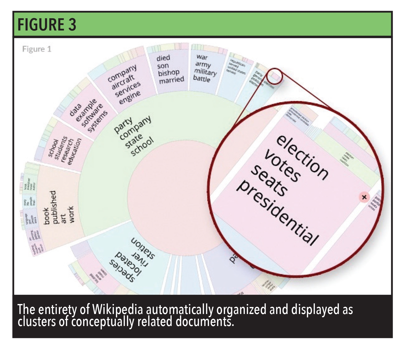
The two tools deliver different results (they do use different underlying technologies, after all), which is precisely the reason to use both tools rather than just one or the other. For example, a firm might start with ESI housed in Relativity and then port portions of that data to Brainspace to evaluate it using the Concept Cluster Wheel. You could then port the results of your examinations back into Relativity, to make use of them there.
Communication Analysis,11 another Brainspace visualization tool, displays networks of communications, such as email and instant messaging. (See Figure 4.)
 With Communication Analysis, communications can be displayed by person, as in the accompanying example, or by domain. You can choose whether to show ‘to,’ ‘cc,’ ‘bcc,’ or any combination of those, and whether to show incoming traffic, outgoing traffic, or both. You can zoom in or out, and you can filter the results in numerous ways. If you are trying to figure out who communicated with whom, about what, and when, a tool like this can be a great asset.
Tableau has been available for over 15 years and is widely used in the larger data analytics world, not just the e-discovery market. Tableau can be used to show clients what types of files they have in their data, sometimes even before the data has been preserved. That information can be displaye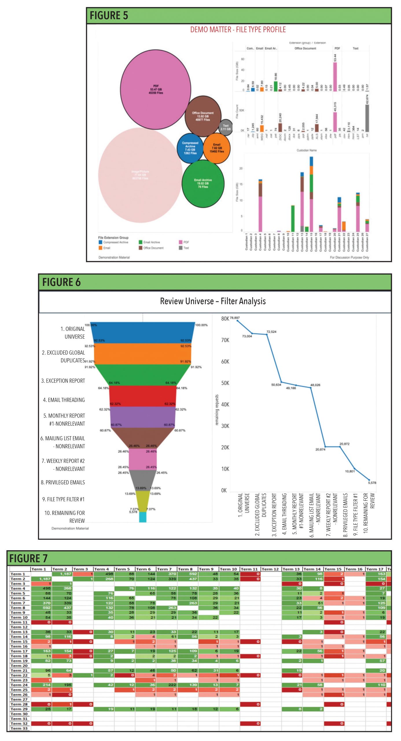 d with circles, where the larger the circle, the more files of that type were in the population examined, or by file size, file count, and file size by custodian. All are shown in the accompanying example. (See Figure 5.)
Tableau helps you better understand how much data has been filtered out at different stages of the review process. (See Figure 6.)
Tableau can also help you better understand the effectiveness of different keywords and combinations of keywords. This enhances your ability to decide which keywords to use, and which to dispense with, as you are evaluating ESI, making decisions about search strategies, and negotiating with opposing counsel. (See Figure 7.)
With this article, I have only touched on the myriad ways in which data visualization can be used to enhance the ability of counsel and their clients to work with and understand the ESI they must contend with in the matters they handle. I also highlighted only a few of the many data visualization tools that can be used toward these ends.
The use of data visualization tools is not yet commonplace among law firms and legal departments (Relativity’s numbers notwithstanding). The use is expanding, however, and rapidly. You may not have seen examples like the ones in this article yet, but expect to see them soon — and not just in articles and at conferences but in courtrooms as well.
Footnotes:
